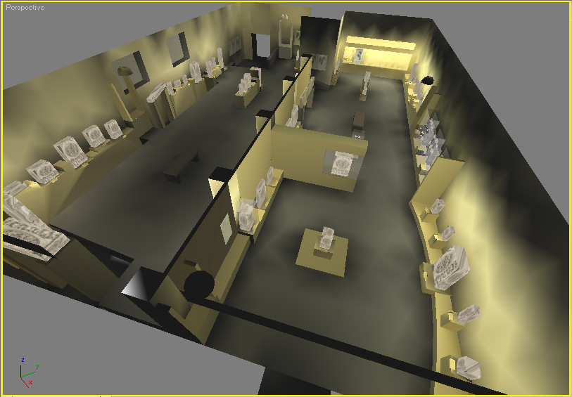
Proposal for modernization of National Museum Galleries followed researching designated themes, collections, study of current layout and visitor flow. The new design made significant change to visitor flows and display of collections.
Spatial planning of the galleries | Themes, topics and layout
Visitor flow
Design took liberty to modify visitor flow by connecting galleries that were separated by a partition wall/panel. It was so old that it felt it was permanent part of the architecture of the building. On close review, we discovered it was in fact an addition done at some point. Moving visitors in the traditional chronological sequence of early dynasties of India made more sense by this change.


Layout
The visitor would experience Indian art in a more meaningful manner, when visitor flow as well as the items were grouped and displayed similarly with identifiable themes and sub themes. This was part of the curation where we rearranged the collection, brought hierarchy to the display design and marked areas for gallery introduction, related historical map and thematic interpretation.


The elements of design
Hierarchy of objects, based on their importance, even when dealing with very different sizes of objects was established in the experience by used of display design and lighting. Key objects were highlighted. Group of related objects by size and material and sometime by theme, were displayed in various formats. This was done to bring more visual interest and drive visitor engagement. Overall use of colours, materials, and showcase design was done to create a more engaging and delightful experience. This was consistently enhanced by use of appropriate lighting. Select areas were marked for “sound domes” as part of the interpretation.


Gallery design | sections used different display formats


Gallery design | Gupta gallery used a deliberate raised wooded flloor


